Building A Global‑Ready Rainwear Identity – Jagvin
Jagvin is a premium rainwear and outerwear brand committed to leading the rainwear market in India and Australia. It offers high‑quality, stylish, and affordable rainwear and jackets that prioritise durability, comfort, and all‑weather protection while promoting sustainability and innovation.
Musing Quills was tasked with creating a visual identity and brand system that could support this international ambition: a brand that looks equally at home on monsoon streets in India and stormy trails in Australia, across both digital and physical retail.
Client Overview: A Modern Heirloom Brand
Brand: Jagvin
Category: Rainwear & jackets (D2C / retail)
Core markets: India and Australia
Brand Mission: “Jagvin is committed to delivering high-quality, durable products that blend functionality with style, exceeding customer expectations while promoting sustainability and innovation in every step of our journey.”
Brand Vision: “To be the leading brand in rainwear across India and Australia, synonymous with premium quality and style, ensuring that Jagvin is the first choice whenever anyone thinks of rain protection and jackets.”
In a category crowded with low‑trust, commodity raincoats and purely functional jackets, Jagvin aims to be the premium, design‑led alternative that still feels accessible.
The Challenge: From Commodity Gear To Aspirational Outerwear
Most rainwear in the Indian and Australian mass market is positioned as:
Purely functional (stay dry, low‑price)
Visually generic, with little emotional or lifestyle framing
Inconsistent brand experience across packaging, retail materials, and communication.
Jagvin needed its brand to:
Communicate premium yet practical – serious about performance, but styled enough to be worn confidently in urban and outdoor settings.
Carry a founder‑rooted story (Jagruti + Vinayak) without feeling like a small, local label.
Scale across global‑facing applications like billboards, shipping boxes, and retailer collateral, not just a logo slapped on a tag.
The identity had to be minimal, strong, and highly reproducible, suitable for everything from woven labels and reflective prints to digital campaigns.
Strategy: A Monochrome, Initial‑Driven Outdoor Mark
The Jagvin brand book reveals a focused strategy:
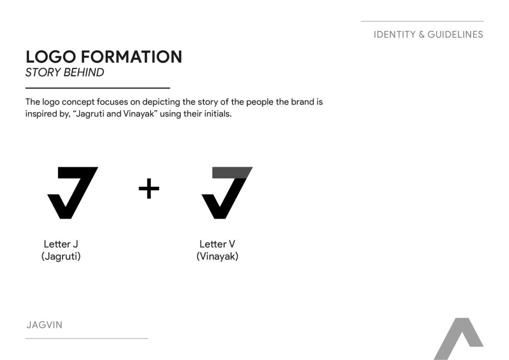
Anchor the brand in a personal founding story
The logo is built from the initials of the two people who inspired the brand, Jagruti (“J”) and Vinayak (“V”), combining them into a single emblem. This lends authenticity and “reason to exist” without cluttering the visual language.
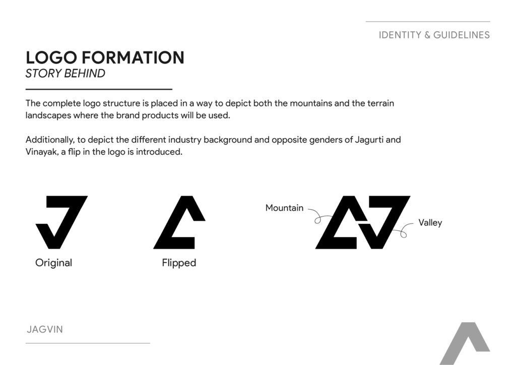
Embed the product environment into the mark
The complete logo structure is arranged to depict both mountains and terrain landscapes—the environments where Jagvin products are meant to perform. This places the brand squarely in an outdoor and all‑weather context, not just generic apparel.
Use the logo to express duality and balance
To reflect the different industry backgrounds and opposite genders of Jagruti and Vinayak, the identity introduces a “flip” in the logo:
One orientation suggests mountain peaks.
The flipped version suggests valleys or terrain.
This subtle device visually encodes balance, partnership, and adaptability—qualities desirable in a brand serving diverse climates across two continents.
Keep the palette intentionally minimal
A black‑and‑white palette gives Jagvin a timeless, technical, and premium look, ideal for performance wear and easy application on varied materials.
Execution: Building The Jagvin Visual System
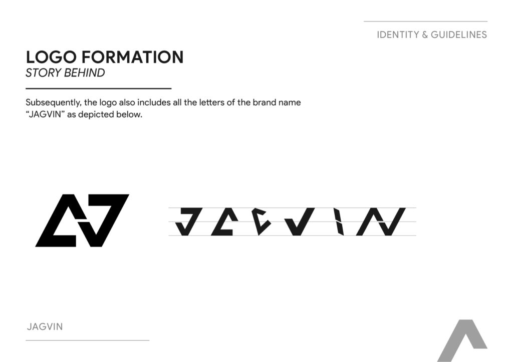
1. Logo Formation & Hidden Letter Story
The brand book details the stepwise formation:
Start with J (for Jagruti) and V (for Vinayak).
Compose them into a unified geometric form that can be read as mountain and valley depending on orientation.
Ensure the symbol also contains all letters of the brand name “JAGVIN” in abstracted form—illustrated as V, J, A, W, V, N—reinforcing that the mark isn’t arbitrary but structurally tied to the name.
This gives Jagvin a logo that is:
Distinctive and ownable in the rainwear category.
Meaningful to the founders and team.
Strong enough to stand as a standalone icon on hardware (zips, buttons, sleeve patches) without the wordmark.
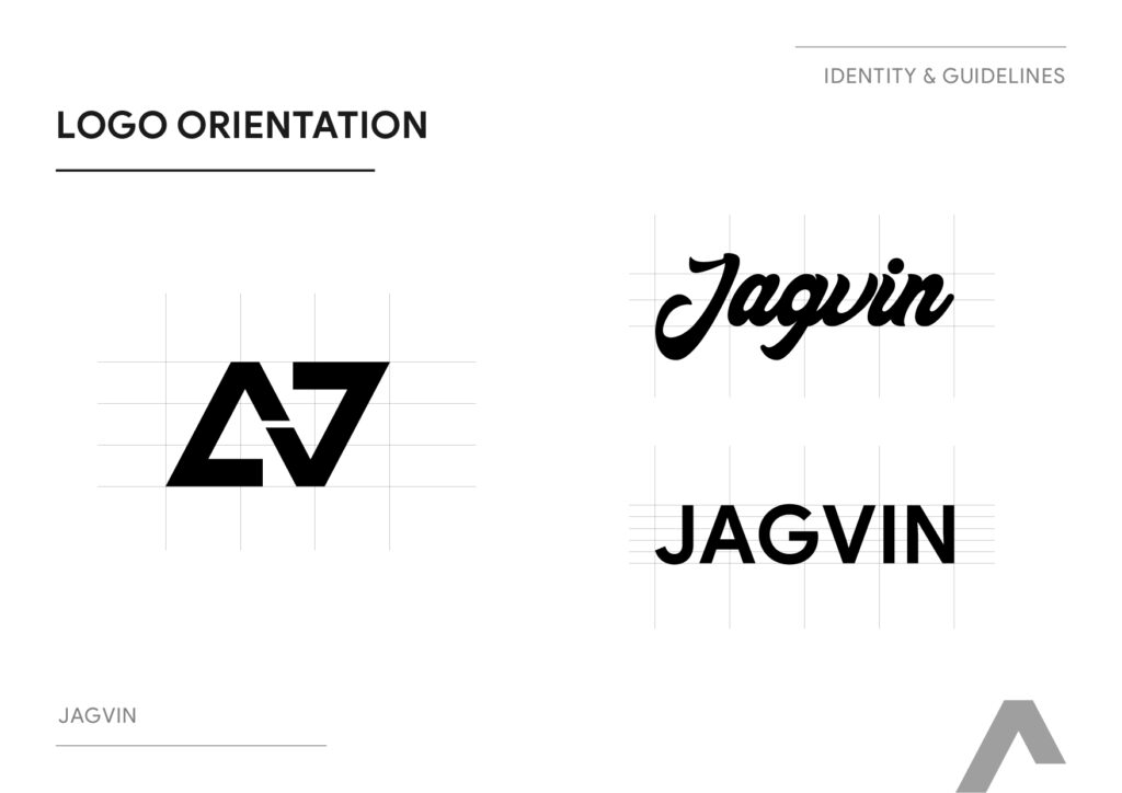
2. Logo Orientation & Usage Rules
The guidelines define allowed orientations for both:
The icon + wordmark combination (“Jagvin” / “JAGVIN”).
The symbol by itself.
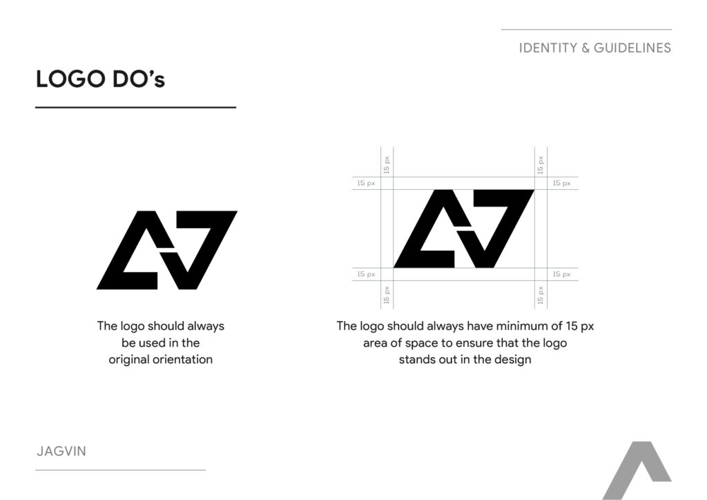
Logo Do’s include:
Always use the logo in its original orientation.
Maintain a minimum 15 px clear space around the logo to ensure it stands out in any composition.
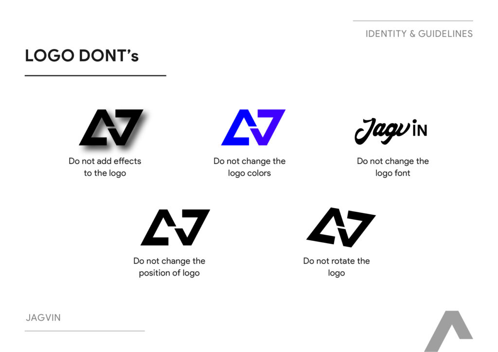
Logo Don’ts strictly prohibit:
Adding effects (shadows, gradients, glows).
Changing colors or fonts.
Shifting elements within the logo.
Rotating the mark.
This discipline is especially important for a brand that will work with multiple manufacturers, printers, and retail partners across markets—preventing brand erosion as it scales.
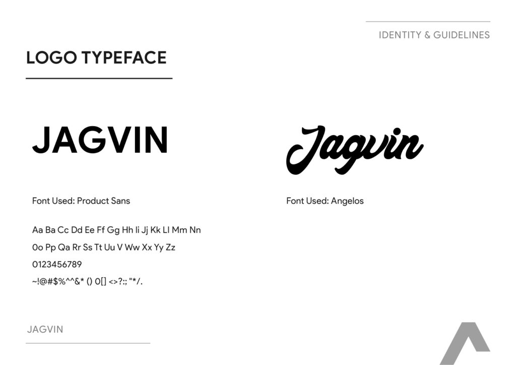
3. Typography: Product Sans + Angelos
The identity uses two distinct type roles:
“JAGVIN” (all caps) – set in Product Sans, a clean, modern sans serif.
Ideal for wordmarks, headings, and any application where clarity and modernity are critical (packaging, labels, digital).
“Jagvin” (title case) – set in Angelos, used more sparingly as a stylistic alternate.
By centering the brand on Product Sans, the system ensures:
High legibility on small items like tags, zip‑pull labels, and ID cards.
A contemporary, tech‑adjacent feel that aligns well with innovation, performance, and global aspiration in apparel.
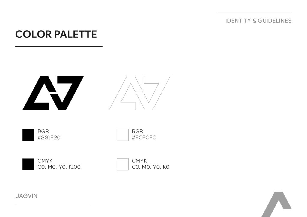
4. Color Palette: Confident Monochrome
The palette is concise:
Primary dark: RGB #231F20, CMYK C0, M0, Y0, K100 – a deep almost‑black.
Primary light: RGB #FCFCFC, CMYK C0, M0, Y0, K0 – near‑white.
This monochrome system supports:
High contrast on garments (dark logo on light jacket, or white logo on dark technical fabric).
Easy translation into one‑colour applications like embroidery, heat‑transfer prints, debossed snaps, and woven labels.
A restrained, premium outdoor aesthetic similar to how leading performance brands lean heavily on black/white with occasional accent colours.
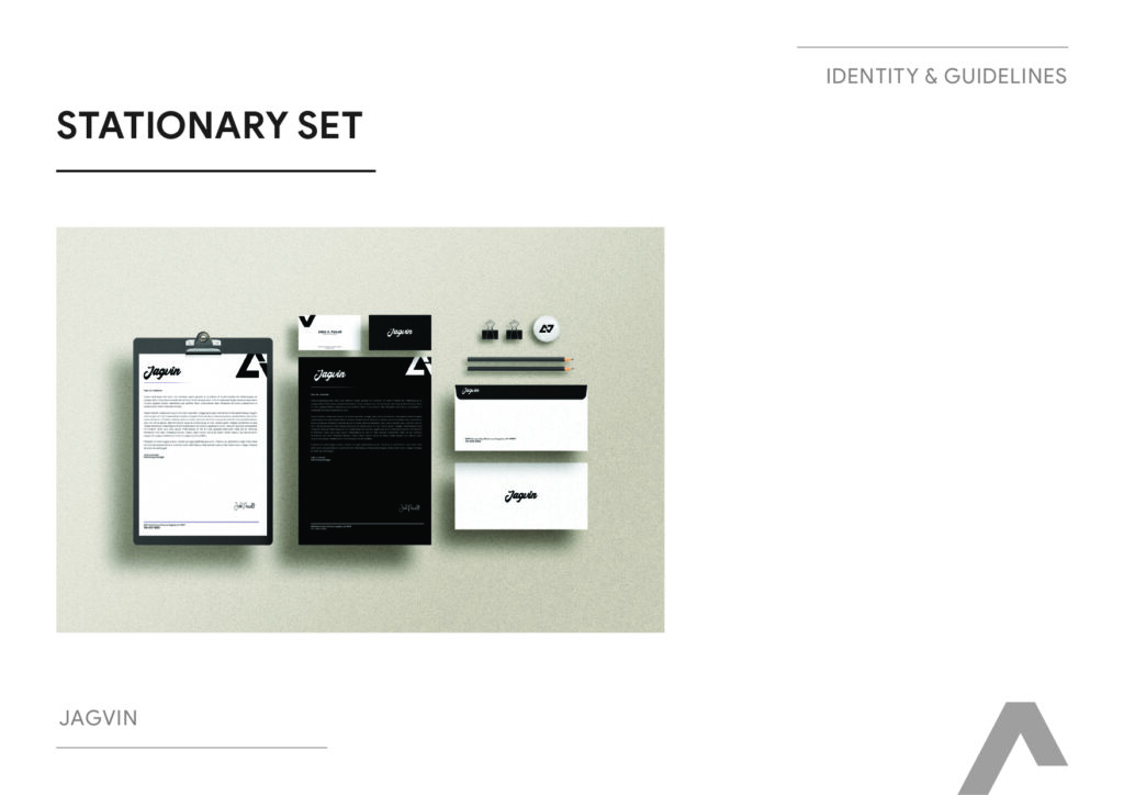
5. Brand Applications: From Stationery To Shelf Packaging
The brand book then demonstrates the identity across a full range of touchpoints:
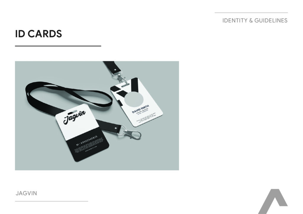
Corporate set: Envelope, ID cards, letterhead, business card, and complete stationery set for trade, vendor, and partner communications.
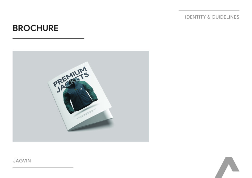
Marketing & awareness:
Brochure featuring “PREMIUM JACKETS.”
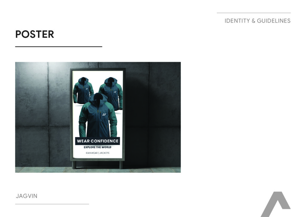
Poster with the headline “WEAR CONFIDENCE – EXPLORE THE WORLD” and a clear product descriptor “RAINWEAR | JACKETS.”
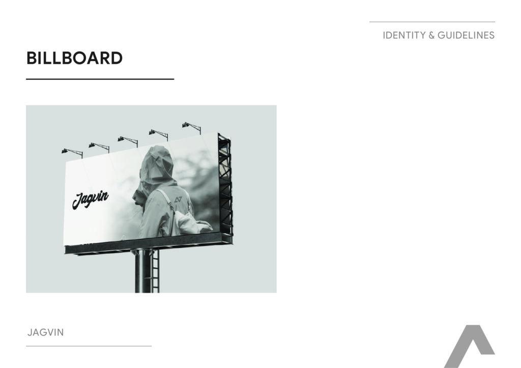
Billboard mockups for high‑visibility campaigns.
Merch & team:
T‑shirts with the wordmark and icon.
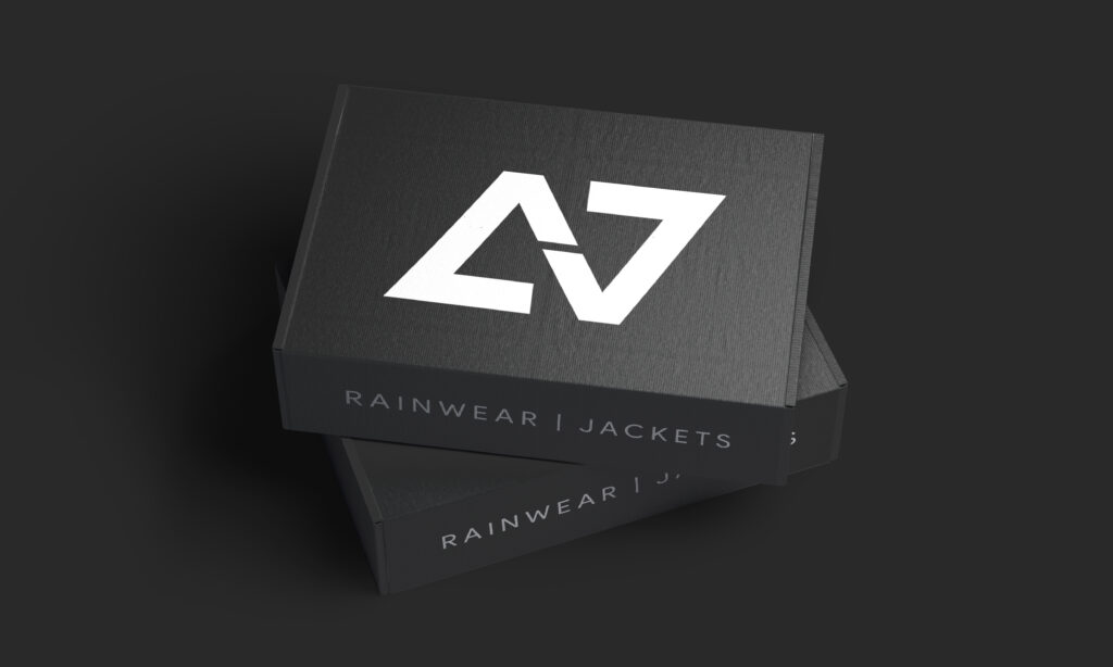
Product & retail packaging:
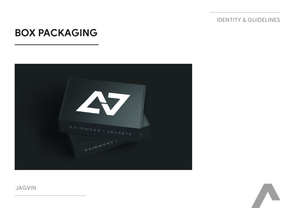
Box packaging clearly labelled “RAINWEAR | JACKETS” with consistent branding.
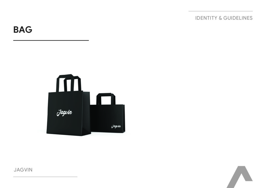
Branded shopping bag.
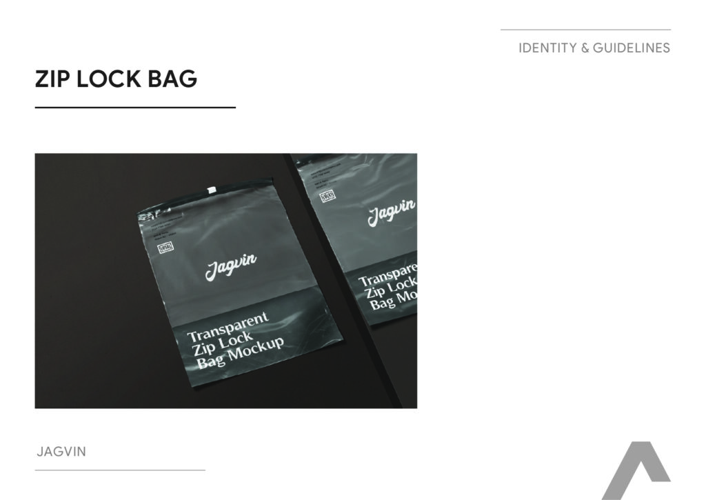
Transparent zip‑lock bag mock‑ups for individual garments, ideal for organised retail and D2C unboxing.
Together, these show that Jagvin’s identity is ready for both offline retail shelves and D2C shipping, not just digital campaigns.
Impact: A Founder‑Rooted Brand Ready For Two Continents
While the brand book itself doesn’t list commercial KPIs, the strategy and system put Jagvin in a strong position to:
Enter and scale across two geographies with a consistent, globally resonant identity rather than a regionally constrained look.
Tell a coherent founder story (Jagruti + Vinayak, mountain/valley symbolism) without making the brand feel small or hobbyist.
Present itself credibly to distributors, retailers, and e‑commerce partners through professional stationery, brochures, posters, and packaging.
Maintain visual consistency as new SKUs and product lines launch, thanks to clear rules on logo, typography, and color.
In a category where many players compete on discount and informal branding, Jagvin now has the visual infrastructure of a premium international label.
Strategic Takeaways For Apparel & D2C Branding
For MQ, Jagvin pushed us back to basics in realising that we can:
Turn founder initials into a scalable global mark
Using J & V to build a symbol that also evokes mountains/terrain shows how you can encode story and environment into a minimal logo.
Use monochrome to signal performance and premium
A tight black‑and‑white system makes the brand easy to reproduce on tech fabrics and packaging while keeping it visually aligned with international outdoor labels.
Design for manufacturing and retail reality
By thinking through boxes, zip‑locks, bags, and billboards—not just social posts—you’ve created an identity that’s ready for factories, warehouses, and shelves, not only Figma.
Balance emotional story with clean modern execution
Jagvin’s identity shows that you can honour founders and narrative (Jagruti & Vinayak, mountain/valley) while still delivering a crisp, contemporary system that looks investable and retail‑ready.