Building A Principle-Led Brand For Global Trade – Mabda Group
Mabda Group is a UAE‑headquartered trading and commercial bridge brand built to connect global manufacturers with regional industrial buyers across the Middle East, Africa, and Europe. The brand is rooted in the Arabic word Mabda (مبدأ), which means principle, origin, or beginning, and uses that meaning to frame a business built on integrity, reliability, and long-term relationships.
Musing Quills developed a full identity system for Mabda Group that turns an abstract trading business into a premium, credible, internationally readable brand.
Client Overview: A Modern Heirloom Brand
Brand: Mabda Group
Category: Trade, sourcing, and commercial bridge / B2B industrial procurement
Base: UAE
Brand Mission
Mabda aims to close the gap between manufacturers and regional buyers by combining international reach with local market knowledge, transparent pricing, and dependable execution.
Brand Vision
To become a trusted bridge across major trade corridors by building commercial relationships that outlast individual transactions and create faster, more reliable trade outcomes.
This is a category where trust is everything. Buyers need consistency, transparency, and proof that the company can deliver across markets with very different commercial realities.
The Challenge: Make Trade Feel Structured, Modern, And Human
The brand was solving a real market problem: manufacturers often lack local relationships, while buyers struggle with unreliable supply chains and opaque pricing. But a trade brand can easily look generic or overly corporate if it doesn’t have a sharp identity.
Mabda needed to:
Communicate international credibility from day one.
Explain a complex business model in a simple way.
Feel serious and principle-led, not transactional or opportunistic.
The identity therefore had to work across procurement, relationship management, and business development touchpoints, while still feeling elegant enough for a premium UAE-based B2B brand.
Strategy: Principle, Corridors, And Growth
The identity strategy is built around a very strong conceptual core:
The name is the philosophy
“Mabda” means principle, and the brand book explicitly uses that meaning as the foundation for brand behaviour: act with integrity, deliver what you promise, build long-term relationships.
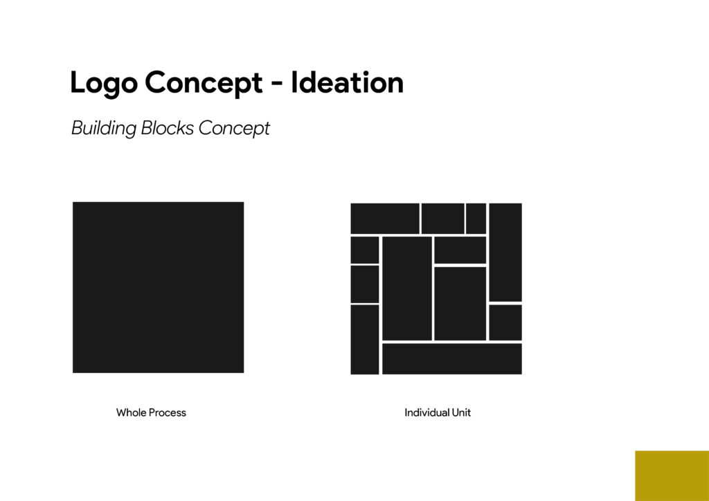
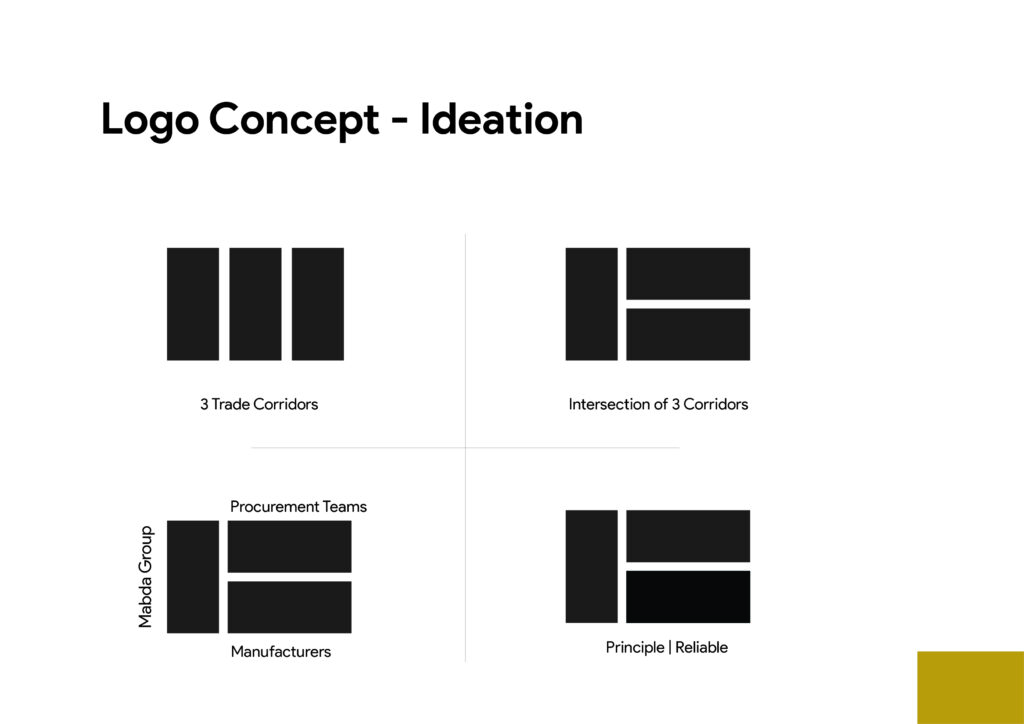
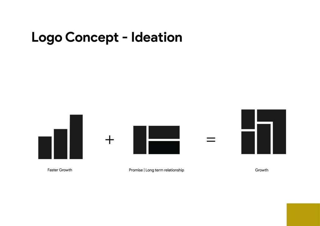
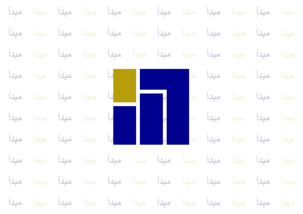
The logo encodes the business model
The logo concept is tied to the idea of building blocks, the whole process, and the intersection of 3 trade corridors. That makes the mark symbolic of how Mabda connects:
Procurement teams
Mabda Group
Manufacturers
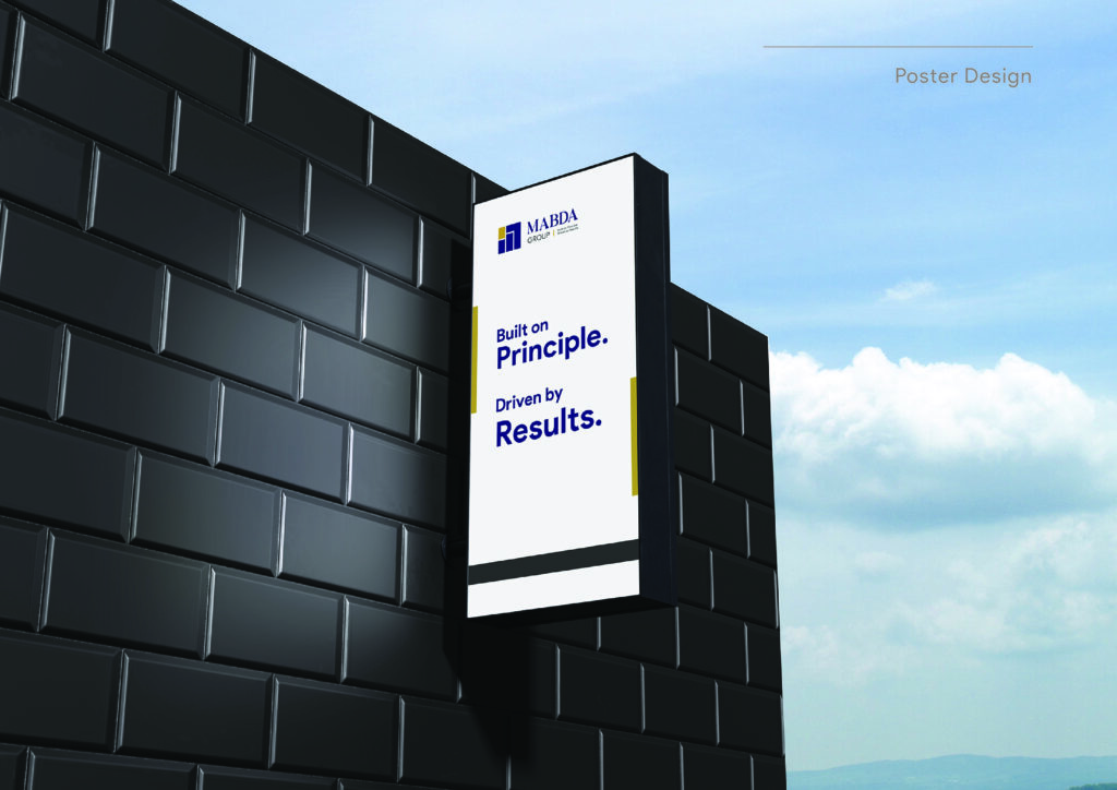
The brand promise balances ethics and outcomes
The tagline “Built on Principle. Driven by Results” captures the duality perfectly: moral credibility plus commercial effectiveness.
That is exactly the right positioning for a trade intermediary in markets where trust gaps are expensive.
Execution: A Minimal, Systemic Brand World
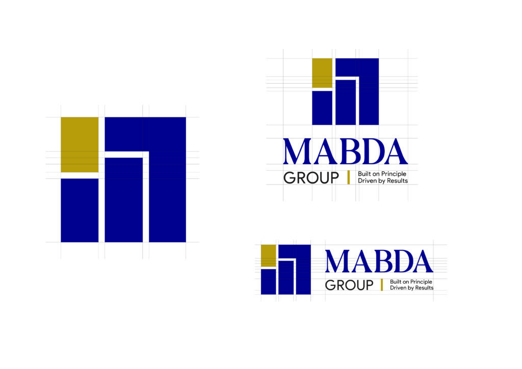
1. Logo Concept
The logo ideation shows three vertical bars and corridor-based forms evolving into a final mark that represents growth through connection. The system is not decorative for the sake of decoration; it is a visual explanation of the brand’s role in bridging supply and demand.
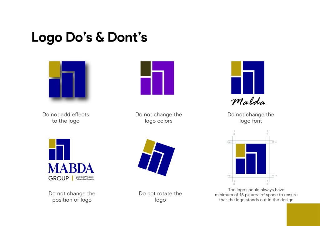
The guidelines also reinforce logo discipline:
Keep original orientation.
Maintain clear space.
Avoid shadows, colour changes, font changes, rearrangement, or rotation.
That consistency matters because B2B trade brands live or die by how polished and dependable they appear in meetings, presentations, and documents.
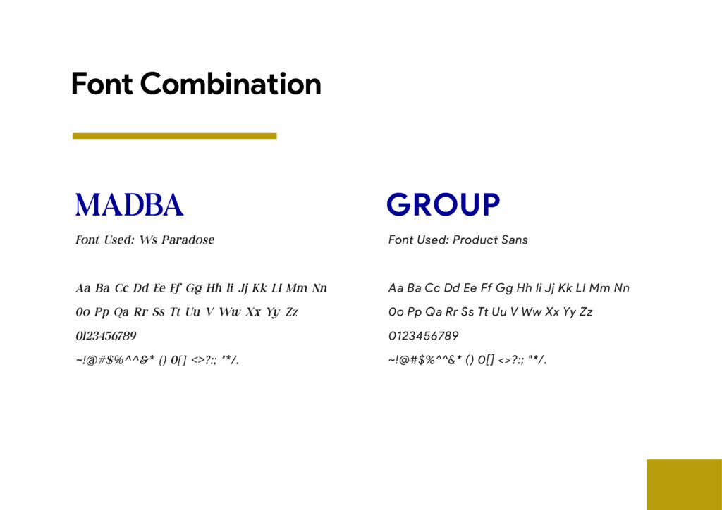
2. Typography
The brand uses two type roles:
Mabda – Ws Paradose
Group – Product Sans
This pairing gives the identity a distinctive, high-character name treatment while keeping the supporting word “Group” clean and modern. It strikes a balance between brand personality and corporate legibility.
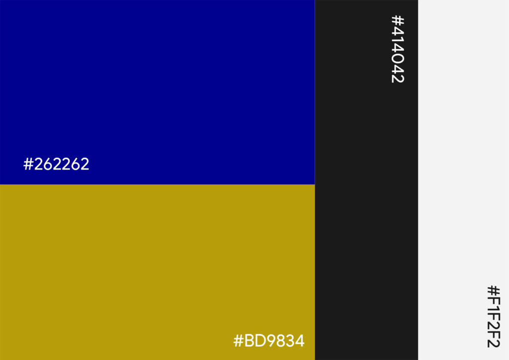
3. Color Palette
The palette is restrained and premium:
#262262
#414042
#BD9834
#F1F2F2
This creates a strong mix of:
Deep corporate blue/grey for trust and professionalism.
Gold for premium positioning and value.
Soft light neutral for breathing room and clarity.
For a global trade brand, this kind of palette reads as established rather than flashy.
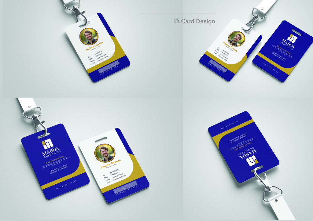
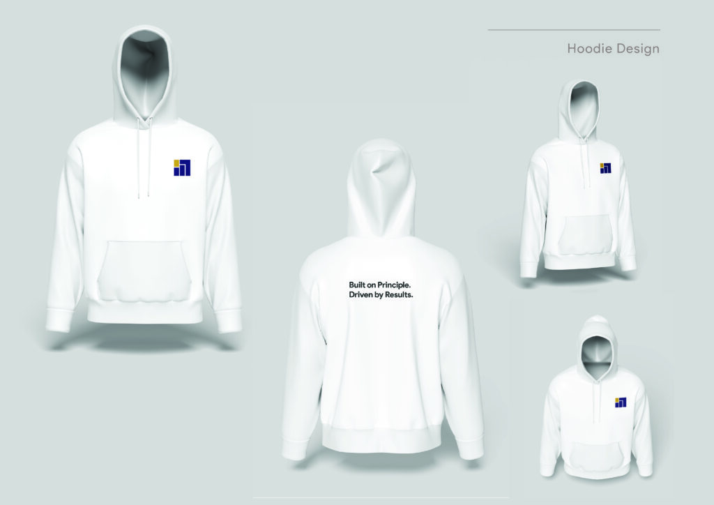
4. Applications Across The Business
The brand guidelines extend the identity to a wide range of operational and commercial assets:
Business cards
Letterheads
ID cards
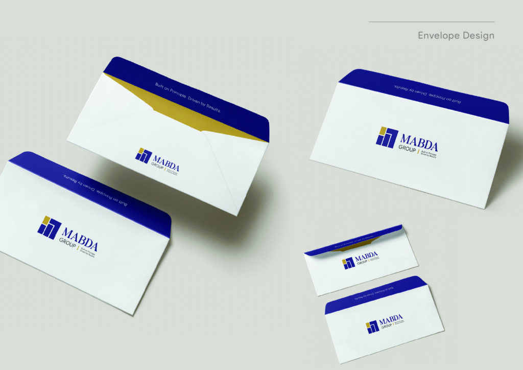
Envelopes
Badges
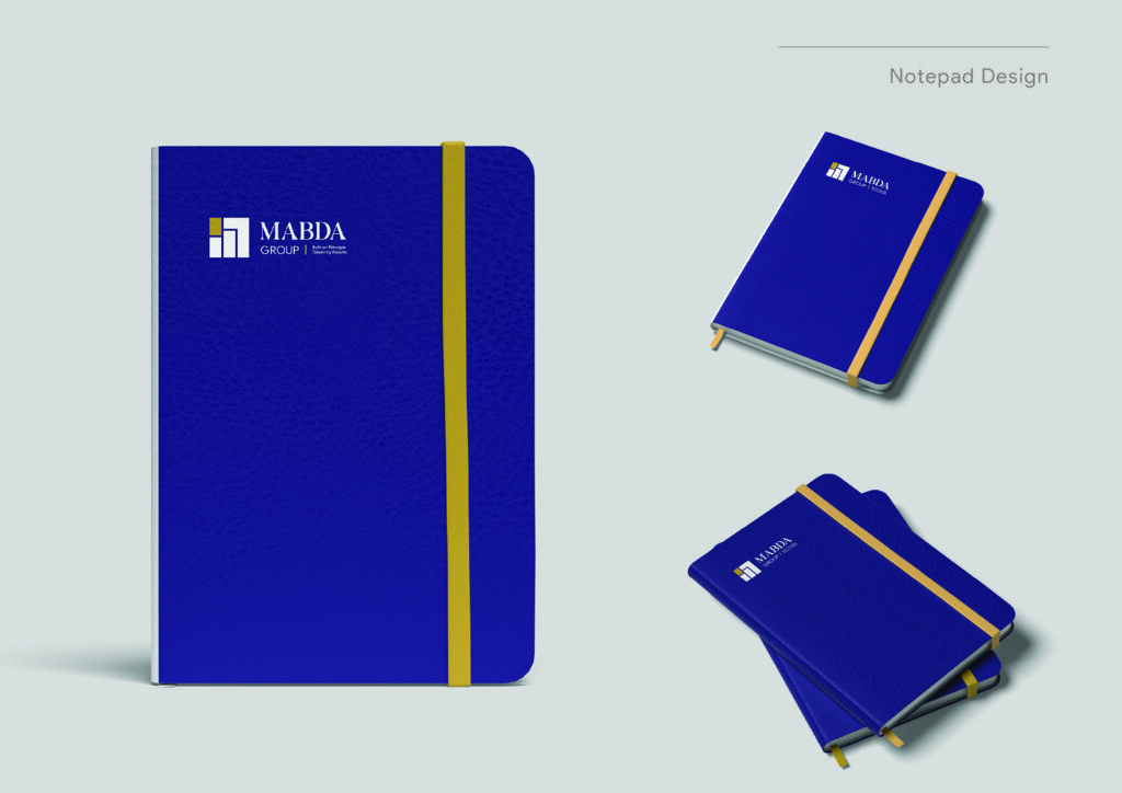
Notebooks
Pens
T-shirts
Hoodies
Caps
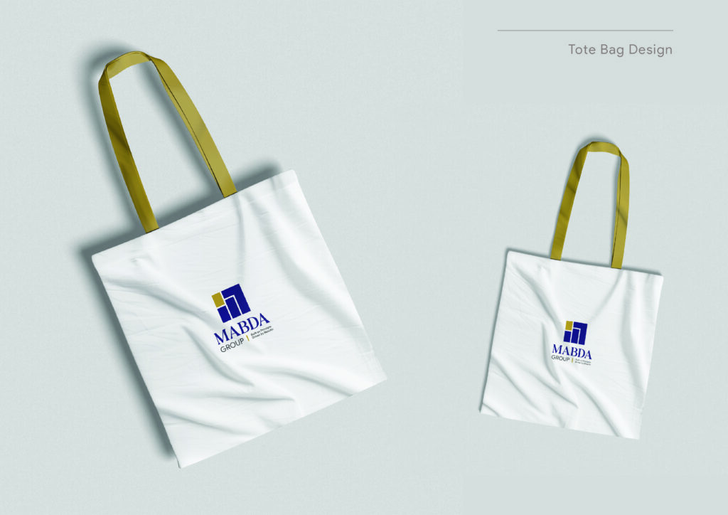
Tote bags
Posters
Standees
Billboards
Facebook visuals
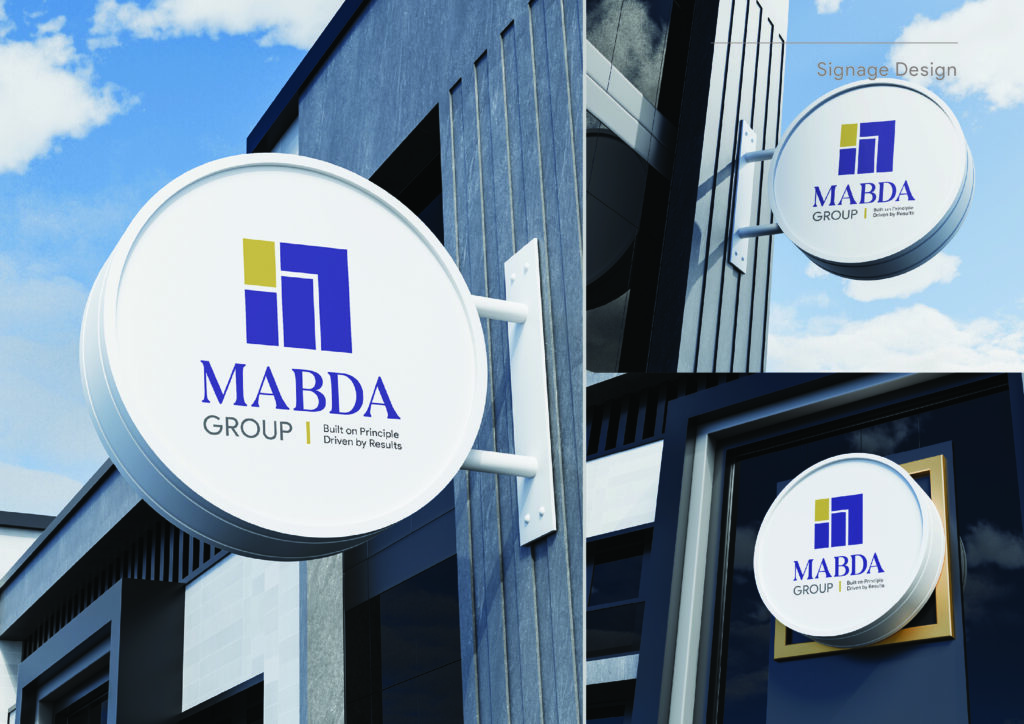
Signage
Favicon
This is important because Mabda is not just a logo on a slide deck. It is a relationship-led B2B business that needs visual consistency across sales, events, hiring, and communication.
Impact: A Trade Brand That Feels Investable
The identity gives Mabda Group three key advantages:
It looks like a serious international operator, not a small local broker.
It communicates a clear philosophy, which helps buyers remember the brand in a crowded procurement market.
It can scale across documents, digital, and physical assets without losing coherence.
In a sector where many companies look interchangeable, Mabda now has a brand system that helps it stand apart on trust, structure, and premium execution.
Strategic Takeaways For B2B Trade Brands
Use naming as narrative
When the brand name already means “principle,” the identity should reinforce that meaning everywhere.
Make the logo explain the business
The corridor/intersection concept gives Mabda a story that is easy to remember and easy to defend in a pitch.
Design for trust at scale
Trade brands need consistency across stationery, events, signage, and digital, because buyers judge reliability by surface cues.
Balance premium with practicality
The palette and typography feel elevated, but still restrained enough for industrial procurement conversations.