Creating A Trust-First Identity For Cross-Border Healthcare Recruitment – Bridge Now
Bridge Now is a tech-powered healthcare recruitment platform that connects international healthcare talent, especially nurses from India, with employers across Europe, with a strong emphasis on Germany. The brand is built around a complex, high-trust journey: verified recruitment, relocation, compliance, and integration for both employers and candidates.
Musing Quills developed a full identity system for Bridge Now that positions it as professional, transparent, and human, while still feeling tech-enabled and globally credible.
Client Overview: A Modern Heirloom Brand
Brand: Bridge Now
Category: International healthcare recruitment / relocation platform
Core markets: Germany and wider Europe on the employer side; India and other international talent markets on the candidate side.
Brand Vision
“To become the leading bridge for connecting top international healthcare talent with opportunities across Europe, transforming lives and advancing global standards of care.”
Brand Mission
“Empower healthcare organizations to overcome workforce shortages quickly and transparently by providing verified, ready-to-relocate professionals and comprehensive relocation support from first interview to integration.”
This is not a simple staffing brand. It is a cross-border trust engine built for hospitals, care homes, and healthcare professionals who need clarity at every step.
The Challenge: Making Recruitment Feel Human, Fast, And Reliable
Bridge Now operates in a category where buyers and candidates face different pain points:
Employers want speed, compliance, and less bureaucracy.
Candidates want support, transparency, and help with relocation, recognition, and integration.
Both sides need to trust that the process is ethical and well managed.
The branding challenge was to create an identity that could:
Look credible to German and European healthcare institutions.
Feel approachable to international candidates.
Communicate fairness, transparency, and support without looking bureaucratic or cold.
Strategy: A Bridge Metaphor With A Human Core
he Bridge Now strategy is built around a clear concept: connection without friction.
1. The name as the promise
“Bridge Now” already communicates what the company does: bridge talent and opportunity, and do it now. The brand messaging reinforces this with statements like:
“Connecting healthcare talent and opportunity without borders—fast, verified, and completely supported.”
“Your bridge to healthcare excellence.”
2. Personality: caregiver plus sage
The brand personality is defined as a blend of:
The Caregiver – nurturing, supportive, empathetic.
The Sage – expert, trustworthy, and clear.
That is the right balance for a service where emotional reassurance and procedural competence must coexist.
3. Audience-first clarity
The guidelines identify two key audiences:
Healthcare employers in Europe, especially Germany, the UK, and Scandinavia.
International healthcare professionals from India, North Africa, and Southeast Asia.
This dual-audience clarity shaped the identity, copy, and applications so the brand can speak to both sides without confusion.
Execution: A System Designed For Trust
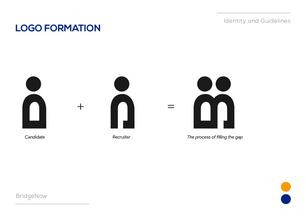
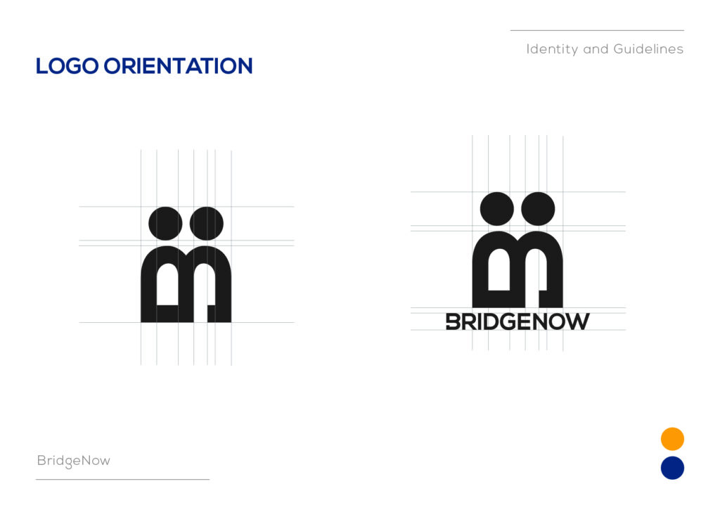
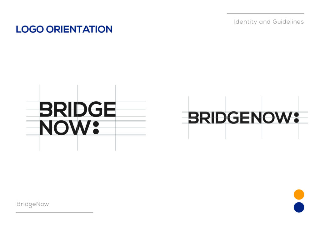
1. Logo Formation
The logo is conceptually built on Candidate + Recruiter = filling the gap. That makes the logo more than a decorative mark; it becomes a visual metaphor for the company’s role in solving workforce shortages.
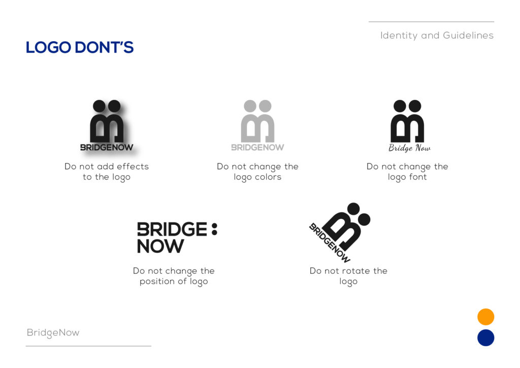
The guide includes strict rules for:
Original orientation only.
Minimum clear space.
No effects, no colour changes, no rotation, no font changes.
This is important because trust brands lose credibility quickly when their logo is applied inconsistently.
2. Typography
The logo typeface is Nexa, a clean modern sans serif.
That choice supports the brand’s position as:
Modern and digital.
Accessible and non-intimidating.
Corporate enough for employer stakeholders, but not overly rigid.
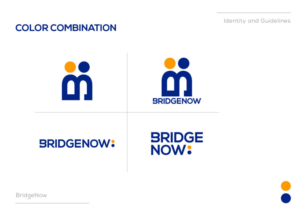
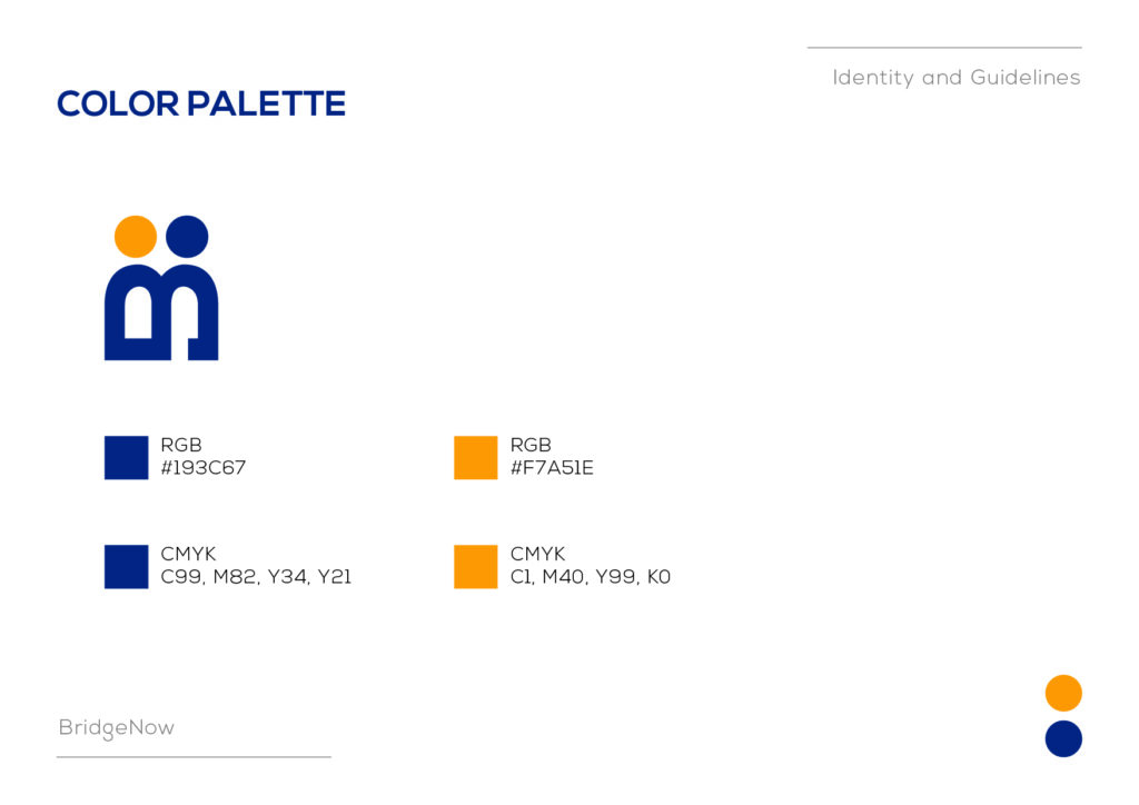
3. Colour Palette
The primary palette is a strong blue and a warm orange:
Blue: RGB #193C67
Orange: RGB #F7A51E
This is a smart pairing for the category:
Blue signals trust, stability, and professionalism.
Orange adds energy, optimism, and human warmth.
Together, they help Bridge Now avoid the common trap of looking like a sterile recruitment portal.
4. Applications Across The Brand World
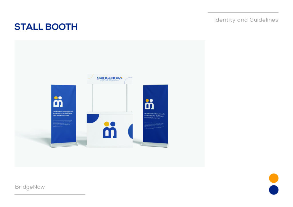
The identity was extended into a full set of touchpoints:
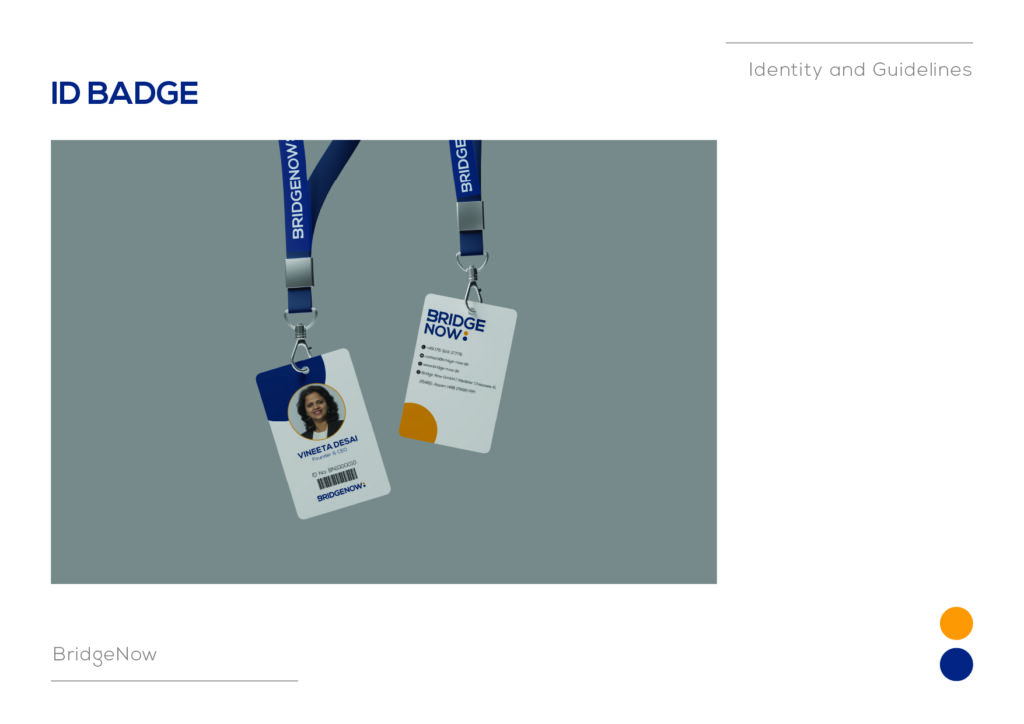
Badge and ID systems.
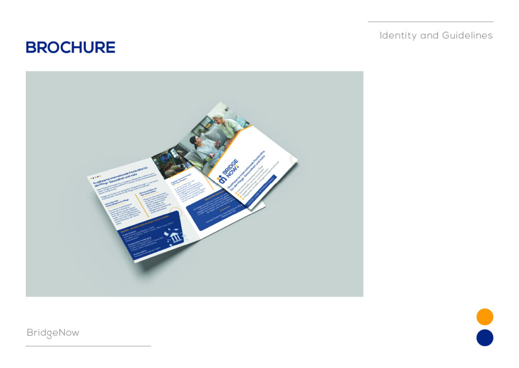
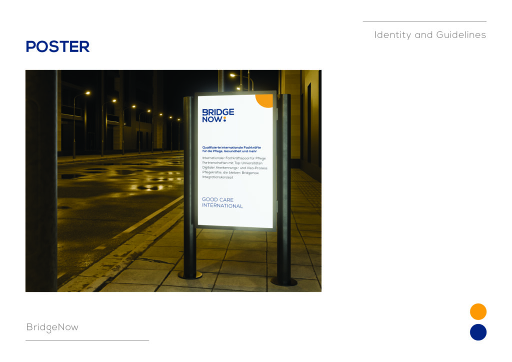
Brochure and poster design.
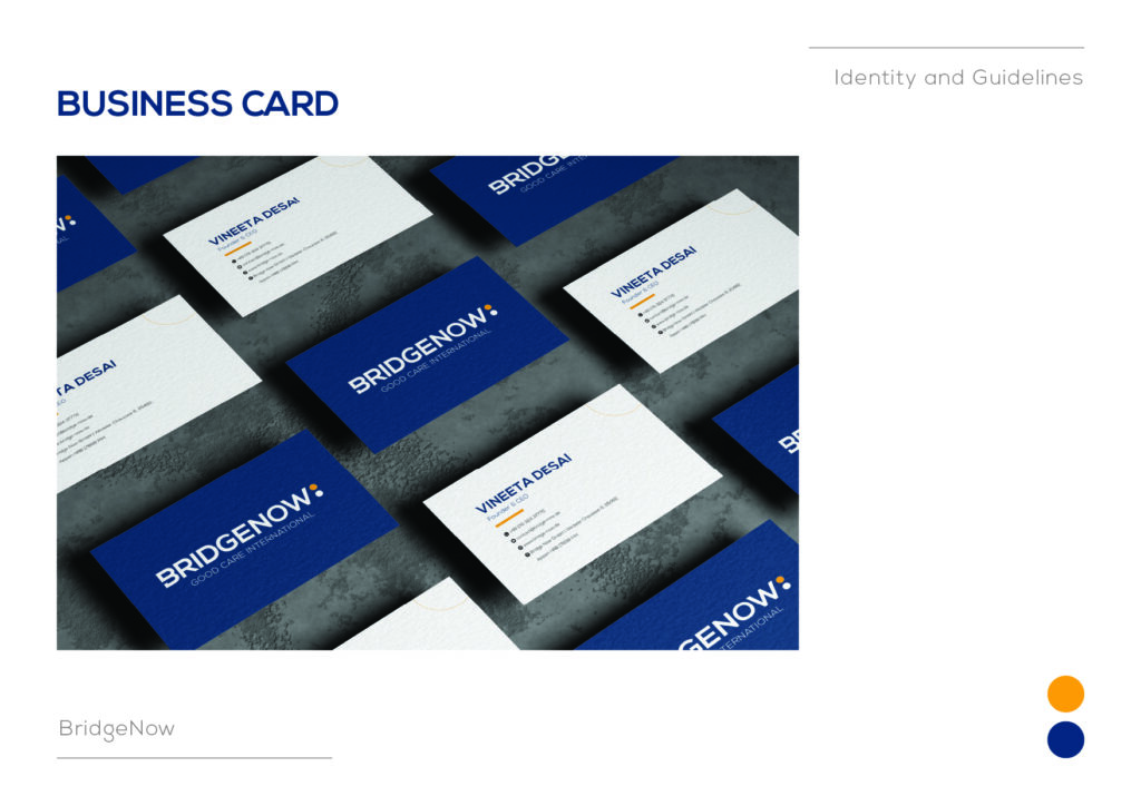
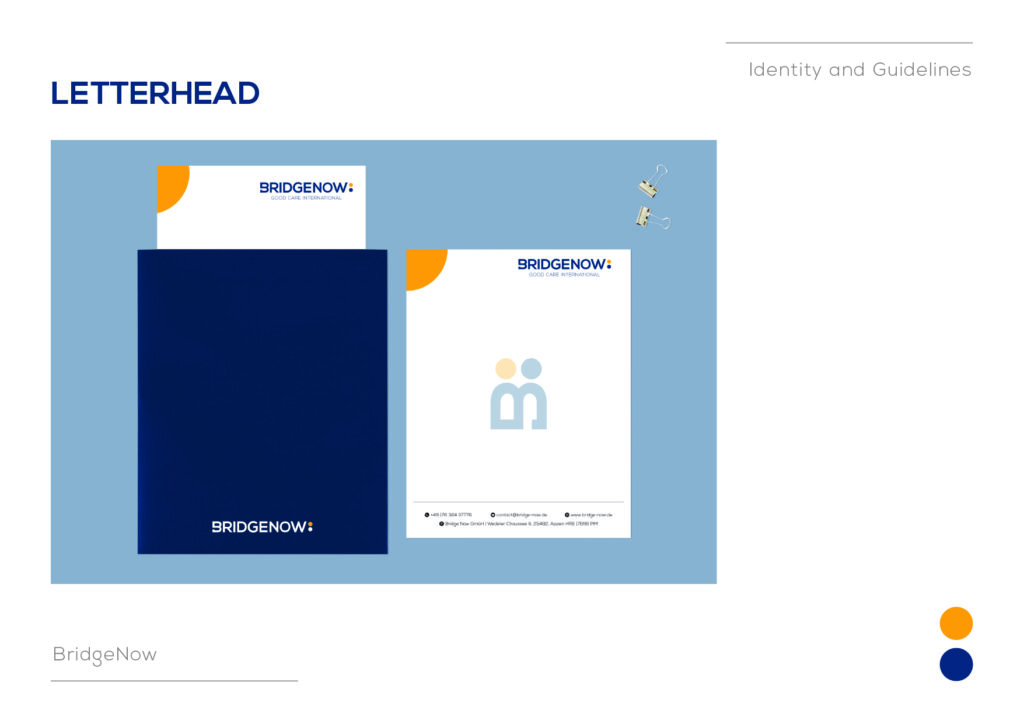
Business cards and letterhead.
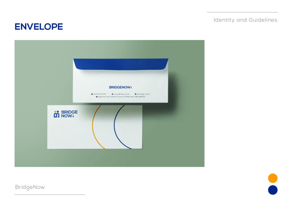
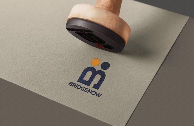
Envelopes and stamps.
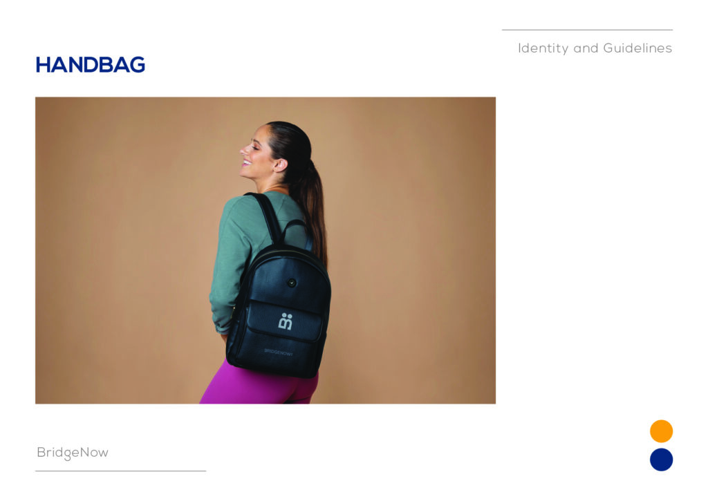
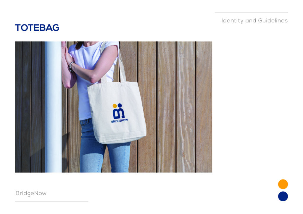
Uniforms and tote bags.
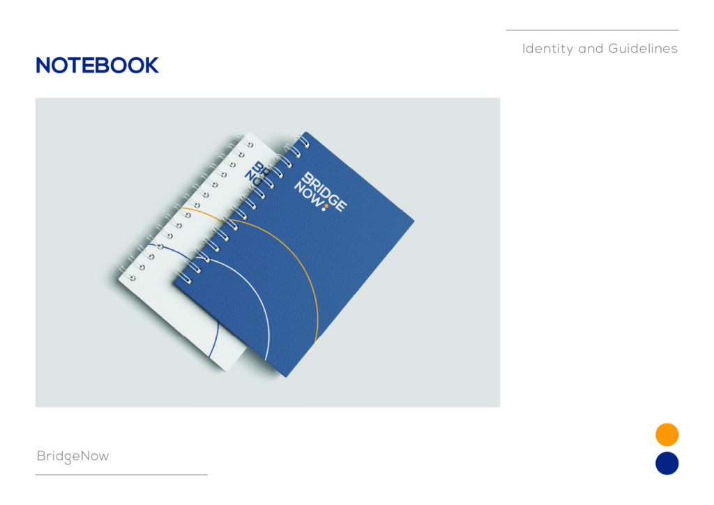
Notebook and pen branding.
Facebook and LinkedIn banner formats.
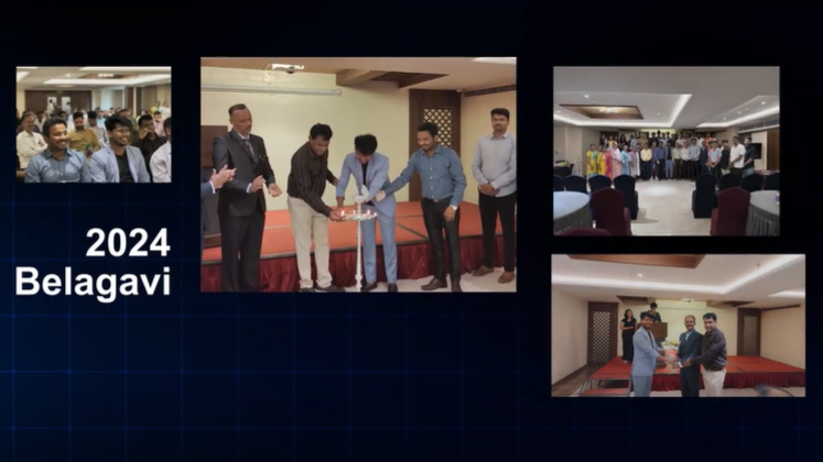
This matters because Bridge Now is not just a website brand; it is a high-contact service brand that exists across employer meetings, candidate onboarding, events, and online platforms.
Impact: A Recruitment Brand That Feels Legitimate
The identity system helps Bridge Now project the exact qualities the market demands:
Trust for employers dealing with international hiring.
Transparency for candidates navigating a life-changing relocation.
Professionalism across print, digital, and event touchpoints.
Externally, Bridge Now is already being positioned as a platform that supports Indian nursing talent into Germany with end-to-end support and fair recruitment practices. The brand guidelines give that promise a consistent visual system, which is essential in a category where one weak touchpoint can undermine the whole story.
Strategic Takeaways For Employer Brands
Bridge Now shows that we can build identities for serious cross-border businesses by doing three things well:
Use the brand name as a business model
“Bridge Now” directly communicates the service promise, so the visual system should amplify, not overcomplicate, that concept.
Make trust visible in the design system
Blue, orange, Nexa, and structured applications create a brand that feels reliable, human, and organised.
Design for both sides of the market
Recruitment brands must reassure employers and candidates at the same time, so the identity needs to balance authority with empathy.
Systemise every touchpoint
For a service with active outreach, events, and relocation support, brand consistency across badges, brochures, banners, and stationery is not optional—it is the product experience.