Designing A Cohesive Jungle Resort Identity – The Sagwan Resort, Dandeli
The Sagwan Resort is a jungle‑stay style property serving travellers heading into Dandeli’s forests and river‑based adventure circuit in the Western Ghats of Karnataka, a region known for jungle resorts, water sports, and nature getaways. In such a crowded hospitality landscape, a resort’s visual identity is often the first—and sometimes only—signal of its quality and professionalism before a guest ever steps onto the property.
Musing Quills created a comprehensive brand system for The Sagwan Resort, captured in a 36‑section brand guidelines document that covers everything from logo construction and color palette to signage, room textiles, uniforms, and social media.
Client Overview: A Modern Heirloom Brand
Brand: The Sagwan Resort
Category: Jungle resort / holiday bungalows near Dandeli, Karnataka
Dandeli and its surroundings are packed with jungle resorts, riverfront stays, and adventure camps offering similar packages—meals, activities, and nature experiences—competing for attention from the same audience of families, groups, and corporate travellers. In this environment, a resort’s name, signage, and on‑property branding play a critical role in conveying reliability, comfort, and a sense of place before price or packages even enter the conversation.
The Sagwan Resort’s brand guidelines reveal an intent to create a serious, fully systemised identity that can be deployed across more than 30 guest and operational touchpoints.
The Challenge: Standing Out In A Sea Of Jungle Resorts
Around Dandeli, many stays rely on generic logos and ad‑hoc signage while marketing largely on price and activity lists. This can make different properties feel interchangeable to a first‑time visitor comparing options online or via aggregators.
Sagwan’s branding system was designed to address core hospitality identity needs:
Create a distinctive, ownable visual identity that doesn’t get lost among “jungle” clichés.
Ensure consistency across operational assets—from welcome boards and direction signage to towels, key cards, and uniforms—so the resort feels considered and premium at every step.
Give the management team a clear rulebook (do’s/don’ts, construction, palette, typography) so future vendors don’t dilute the brand over time.
Rather than one logo file and a visiting card, the project aimed to build a complete brand ecosystem for an emerging resort in an intensely competitive location.
Strategy: Rooted, Warm, And Operationally Practical
The Sagwan identity revolves around a few strategic design choices visible in the guidelines:
A grounded, timber‑inspired color world
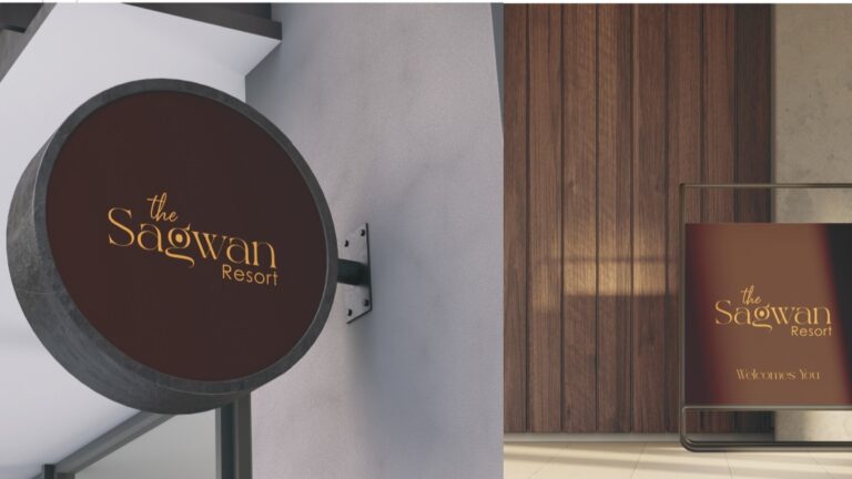
The primary brand color is a deep brown (#451E10), specified for both RGB and CMYK as the anchor of the identity. This choice implicitly references wood, earth, and warmth, aligning with a resort built around nature and rustic stays in the Dandeli region.
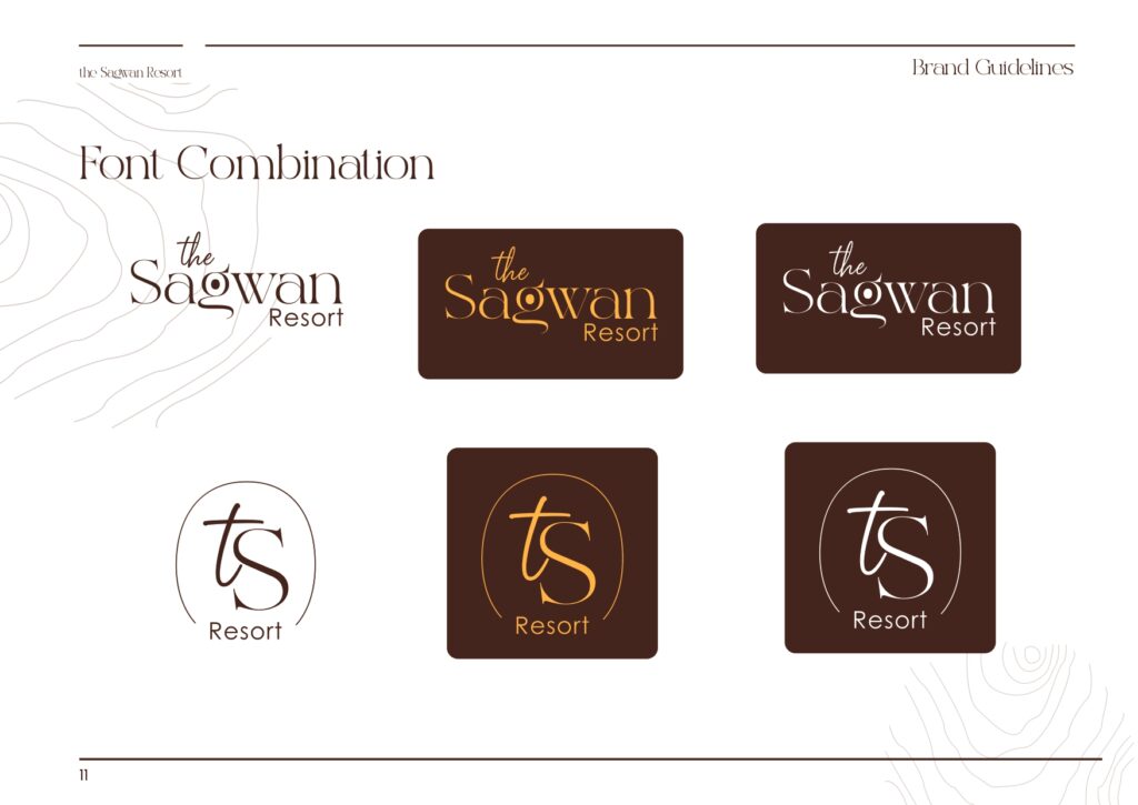
A logotype that balances character and legibility
The name “Sagwan” is set in Excrallik, a decorative script‑style typeface, while “the” uses Sagetarius and “Resort” uses the clean, geometric Century Gothic. This creates a hierarchy where:
“Sagwan” feels expressive and brand‑defining.
“Resort” remains highly legible across signage, documents, and small‑format items.
System over spontaneity
The guidelines lean heavily on construction, usage rules, and applications—a deliberate move to ensure the identity survives long‑term across printers, vendors, and staff turnover.
In hospitality, this kind of systemisation is often the difference between a “random logo on a board” and a recognisable, consistent brand guests remember and recommend.
Execution: From Logo To Every Guest Touchpoint
1. Logo Construction, Do’s & Don’ts
The guidelines dedicate separate sections to logo formation and construction, followed by explicit Do’s and Don’ts.
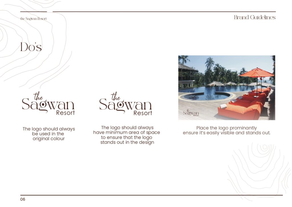
Do’s:
Always use the logo in its original colors.
Maintain minimum clear space so the logo “stands out in the design”.
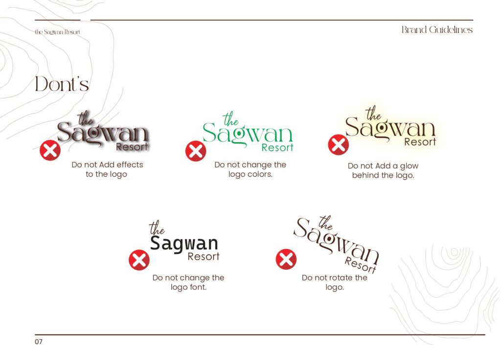
Don’ts:
Do not add effects, glows, or rotate the logo.
Do not change the logo font or colors.
By formalising these, the brand protects itself from the most common ways resort logos get distorted over time—especially when multiple agencies or printers get involved.
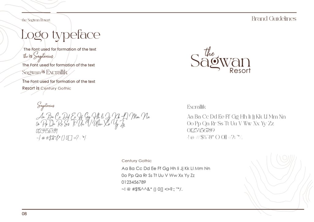
2. Typography System
The logo typefaces are defined clearly:
“the” – Sagetarius
“Sagwan” – Excrallik
“Resort” – Century Gothic
This hierarchy is important because it allows:
The brand name “Sagwan” to carry personality through Excrallik.
Supporting text and extended applications to rely on Century Gothic, which is modern, neutral, and highly legible for body copy, signage, and forms.
The guidelines also show full character sets, enabling consistent typographic use even if future designers have to recreate layouts from scratch.
3. Color Palette & Combinations
The palette section defines:
Primary color: Dark brown (#451E10) with print CMYK values (C‑44, M‑79, Y‑84, K‑67).
Subsequent sections on Colour Combination and Font Combination likely demonstrate how this brown is paired with lighter neutrals and supporting type treatments to preserve contrast and readability, especially on large outdoor boards and low‑light environments common to nature resorts.
4. Collaterals: 30+ Branded Applications
Where this project really differentiates itself is the breadth of applications formalised in the guidelines. The document includes layouts or visual references for:
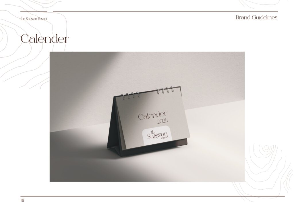
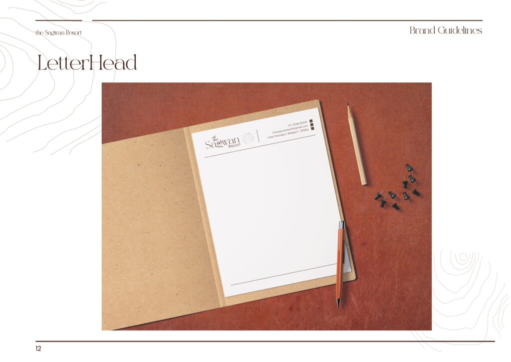
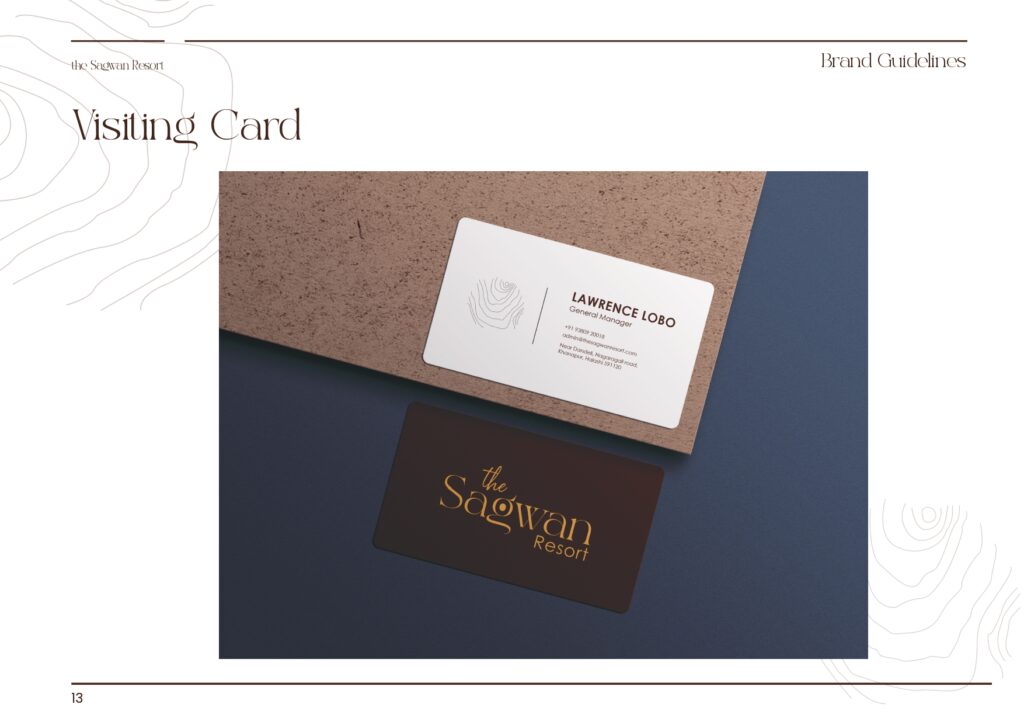
Corporate & guest‑facing stationery – Letterhead, visiting card, calendar.
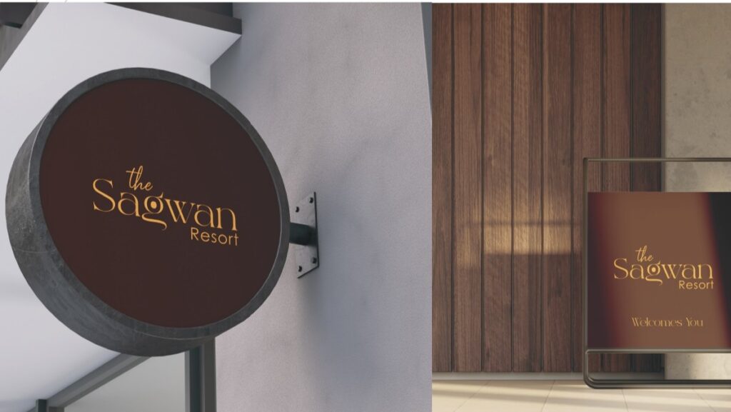
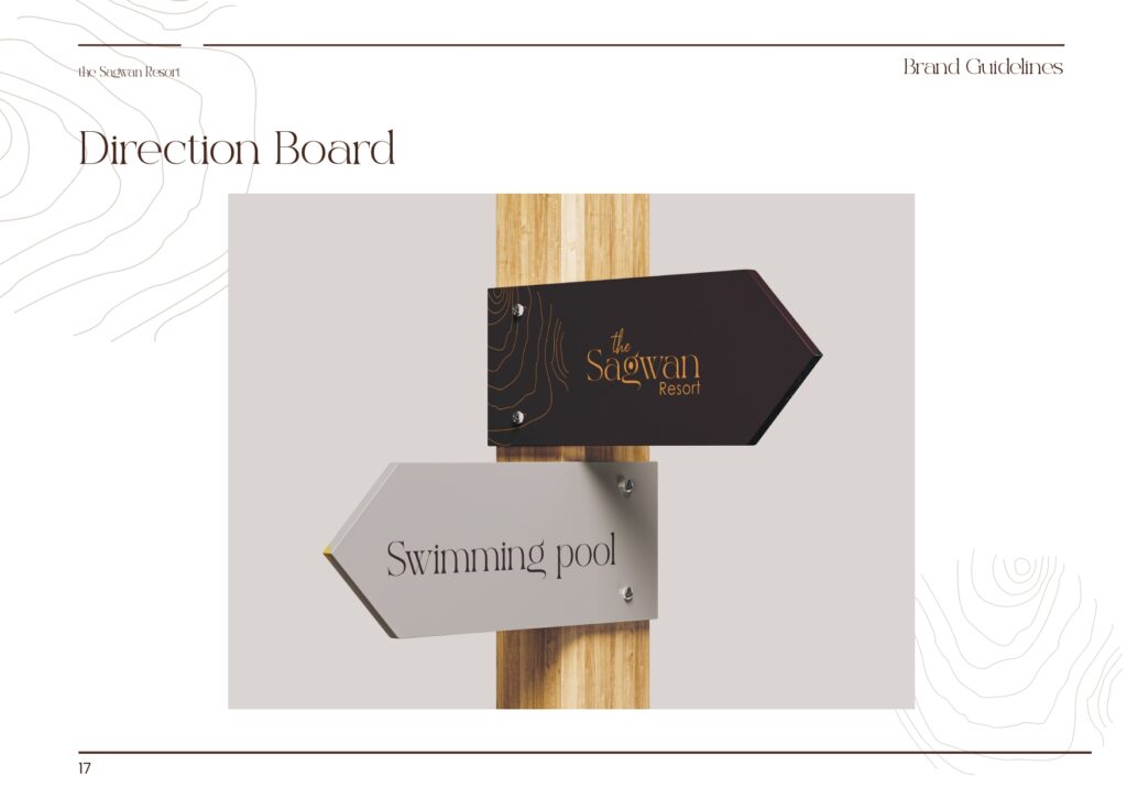
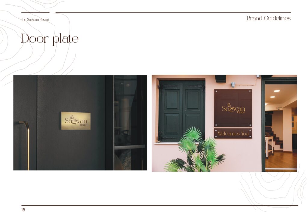
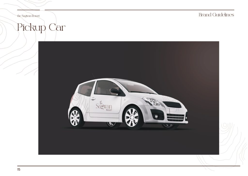
Arrival & navigation – Welcome board, pickup car branding, direction boards, door plates.
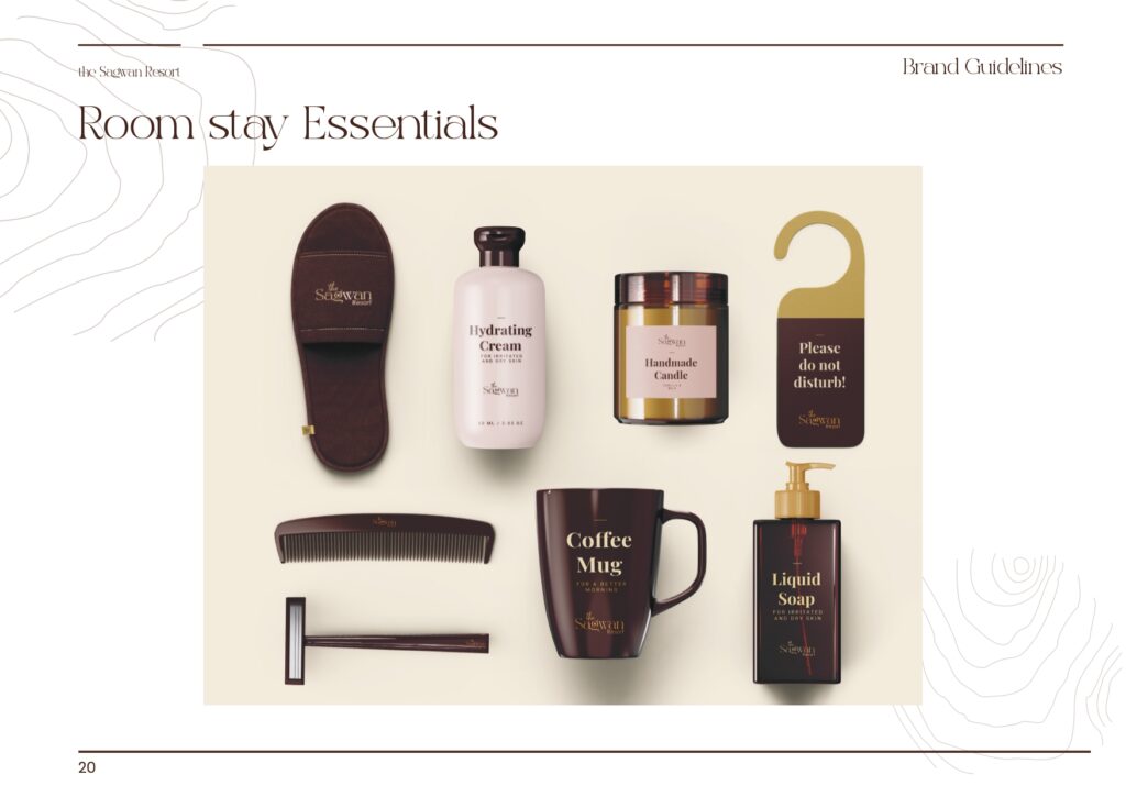
In‑room experience – Towels, room‑stay essentials, tissue paper, blanket, pillow.
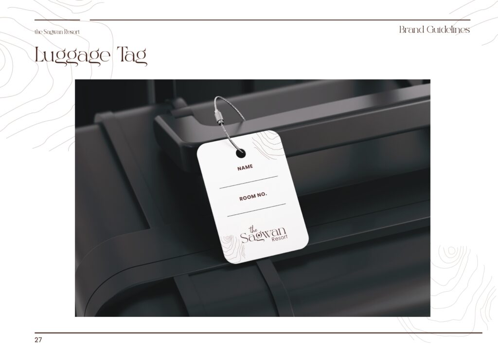
Access & identity – ID cards, key cards, luggage tags, badges.
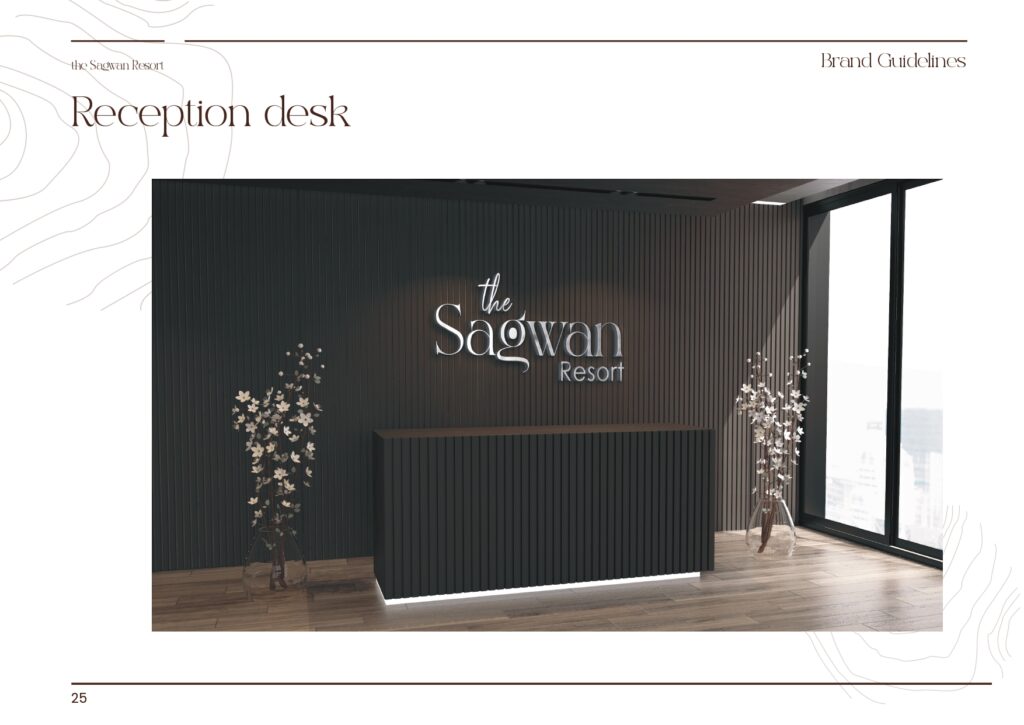
Retail & visibility – Carry bags, light sign board, reception desk fascia.
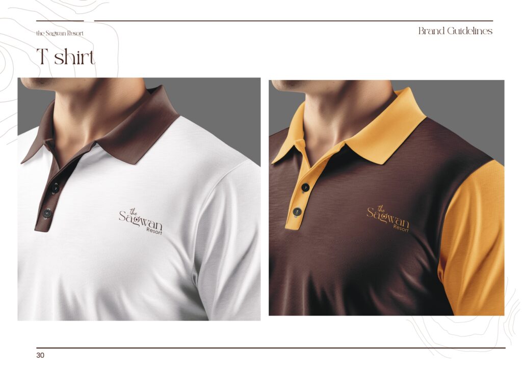
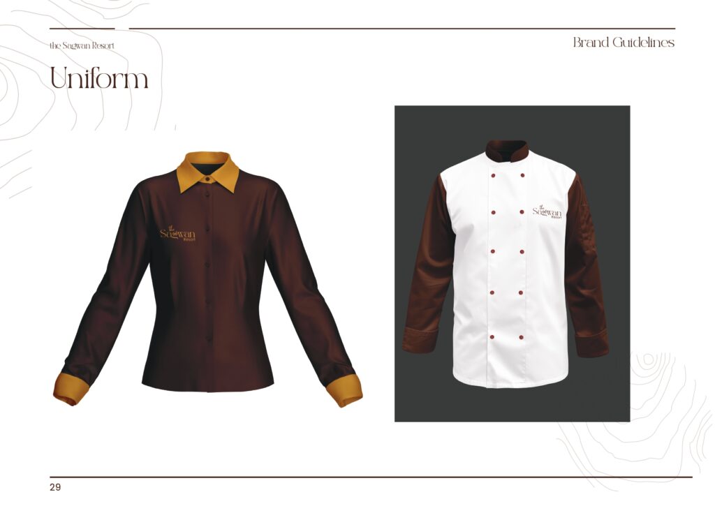
People & uniforms – Uniforms, T‑shirts, aprons.
Marketing – Social media templates and brochures/boarding material.
By pre‑defining these, the Sagwan identity ensures that a guest’s journey—from seeing the resort name on a car or board, to checking in at reception, to using key cards and room amenities—is wrapped in one coherent visual language.
For jungle resorts competing on experience rather than just price, this level of detail helps signal quality at every micro‑moment, even in small things like towels, tags, and tissue packaging.
Impact: A Resort That Looks As Considered As It Feels
While the guidelines don’t contain performance metrics, their structure allows us to see the strategic impact:
The Sagwan Resort now has a codified identity across more than 30 touchpoints, reducing the risk of inconsistent or improvised branding as the property grows.
The dark, timber‑inspired palette and clean typography system give the resort a distinctive, grounded look that fits Dandeli’s jungle context while still feeling premium and organised.
The operations team has a ready reference for all future design and print tasks, lowering friction when onboarding vendors or opening new facilities—crucial for small resorts that often grow organically.
In a market where many jungle stays look interchangeable online, The Sagwan Resort’s identity helps it appear as a considered, professionally run property that values detail as much as adventure.
Strategic Takeaways For Hospitality Branding
System beats one‑off design
A resort brand only becomes real when it lives on cars, signboards, room essentials, uniforms, and digital assets—not just a logo and visiting card.
Design for the full guest journey
Touchpoints like welcome boards, key cards, tissue boxes, and luggage tags all contribute to perceived quality; branding them consistently creates a “premium by default” experience.
Guardrails prevent brand erosion
Clear do’s/don’ts and construction rules protect the logo from distortion across multiple external vendors—critical in hospitality where printing is frequent and decentralised.
Color and typography can echo place
A carefully chosen earthy palette and type pairing can subtly communicate “forest, wood, warmth”, aligning the visual identity with the resort’s natural context without relying on clichés.